BALANCE
Location
Floor Area
Year
Photographer
Kaohsiung City, Taiwan
29.87 P
2024
ArHer Kuo
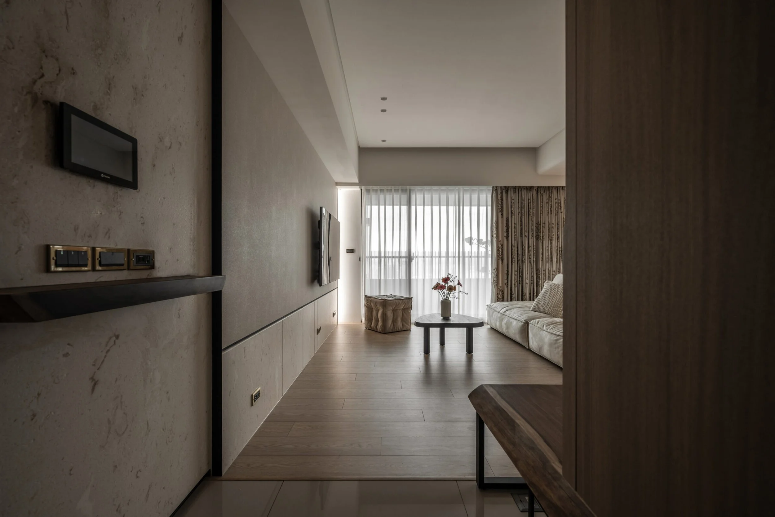
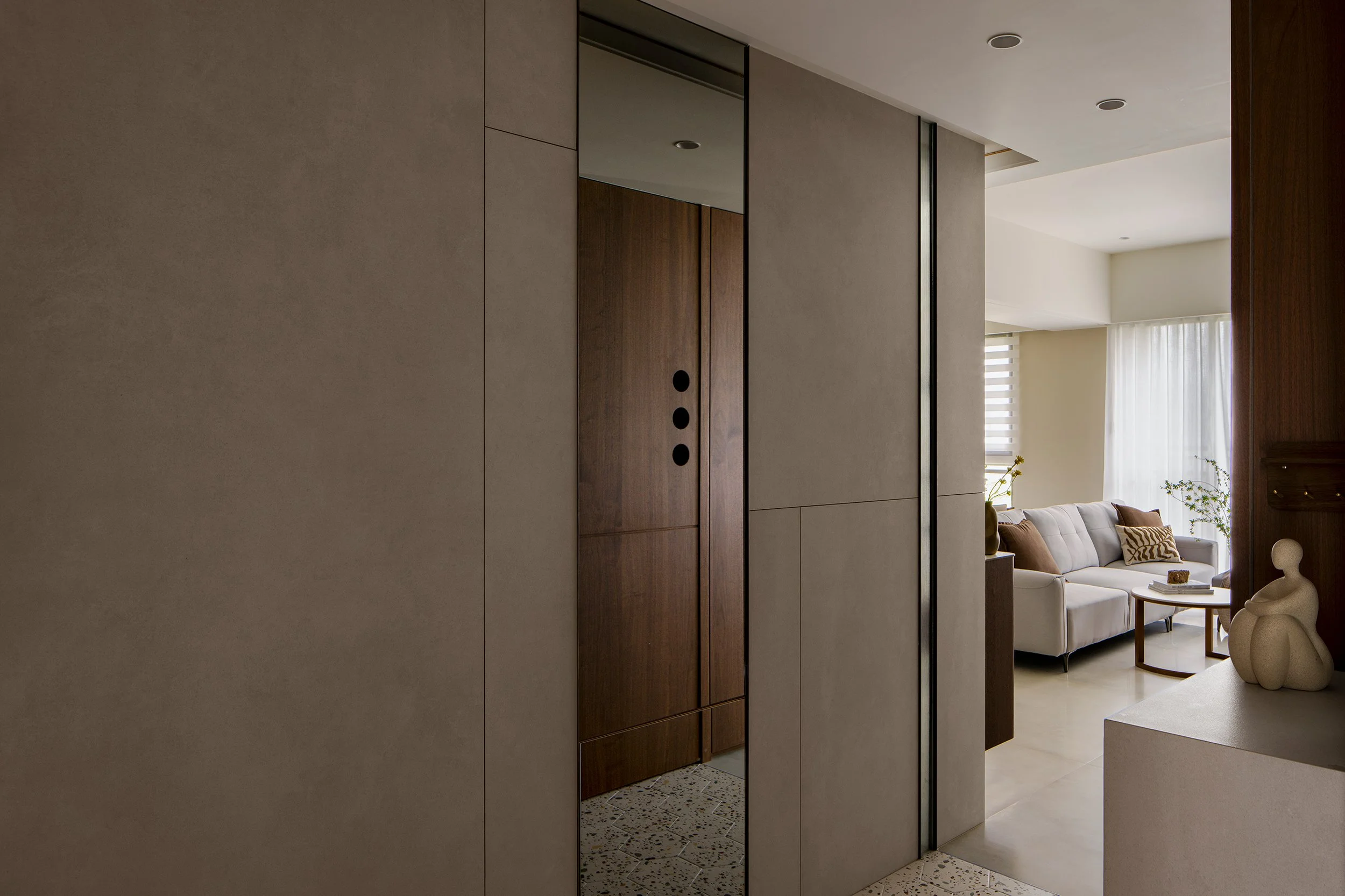
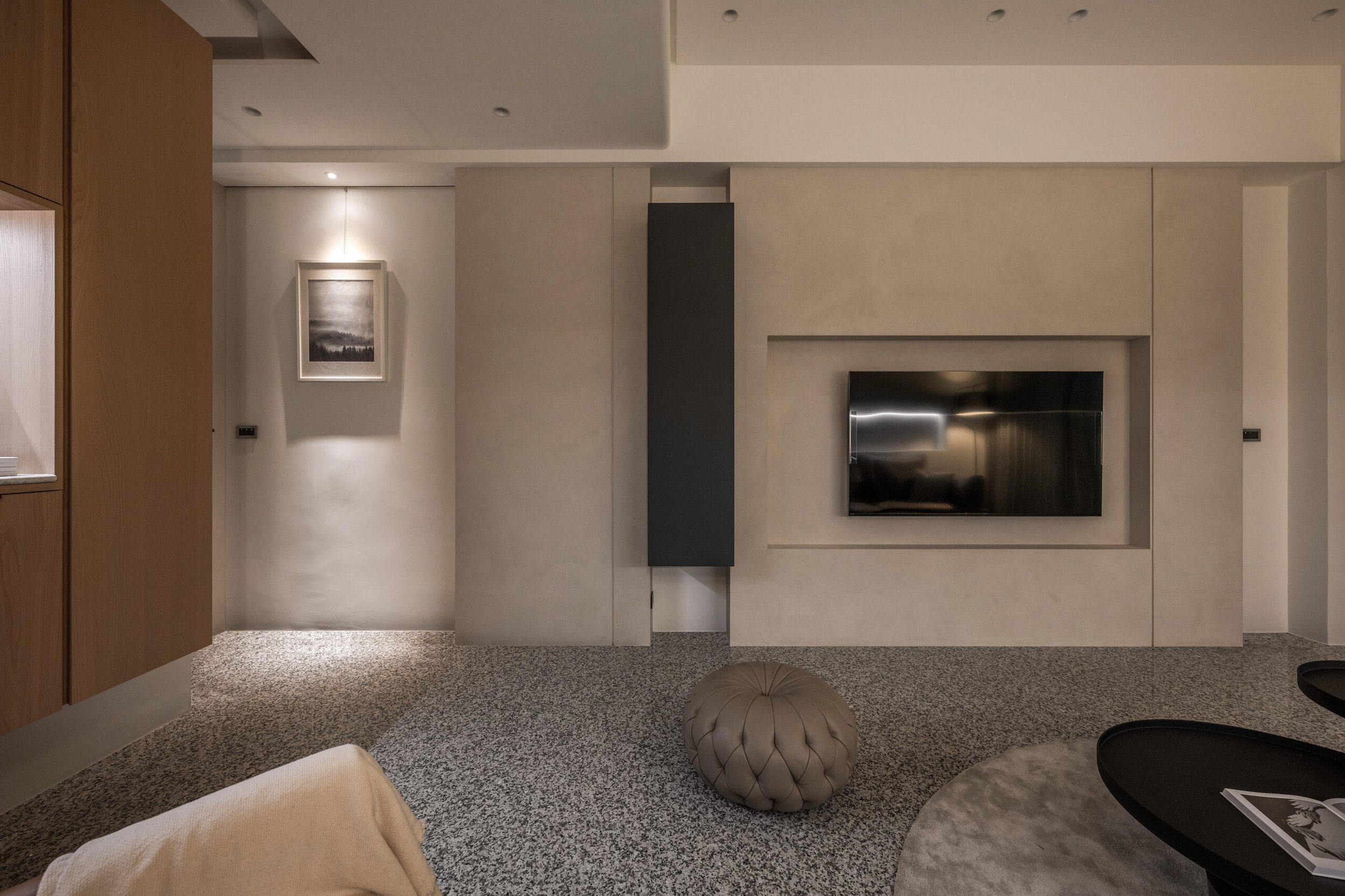
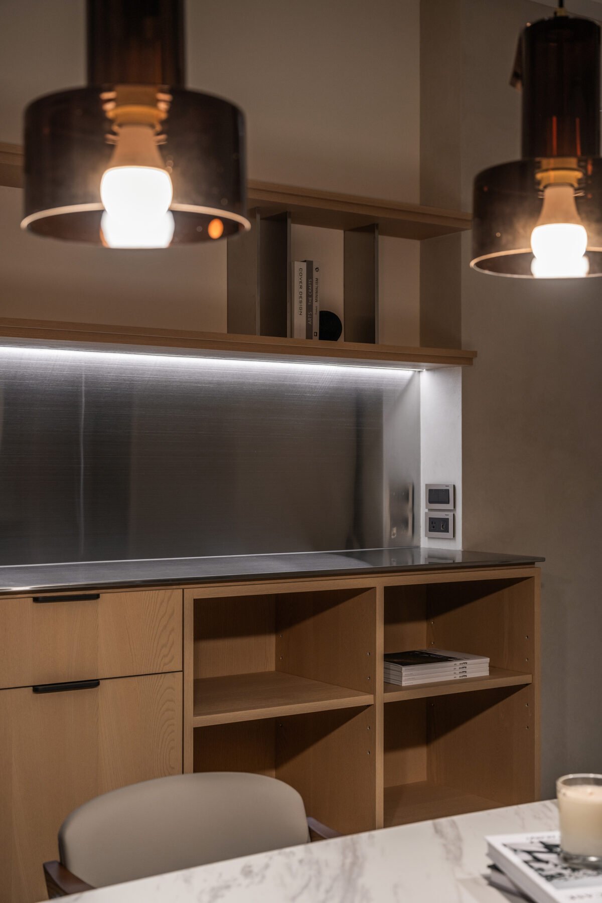
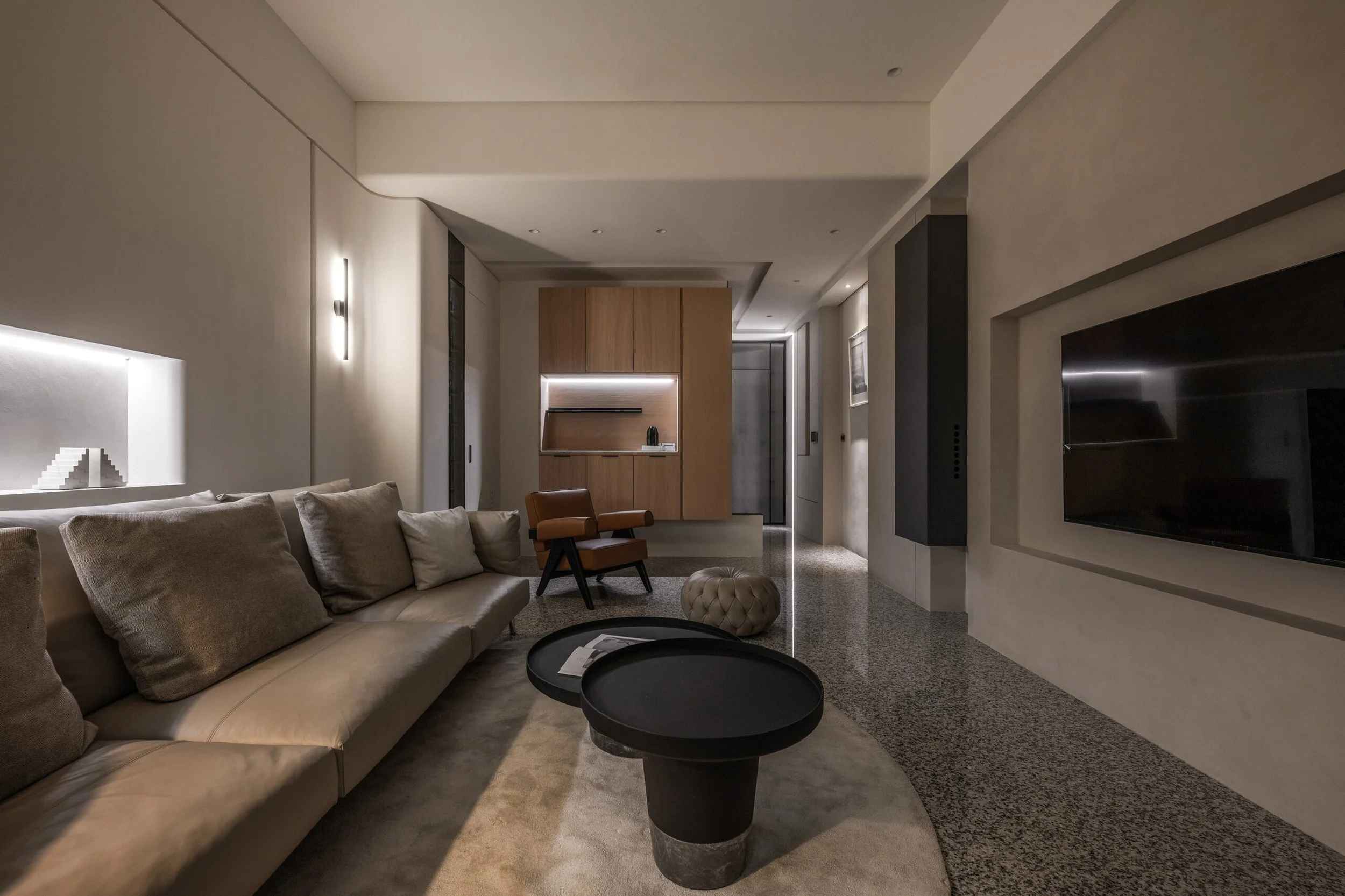
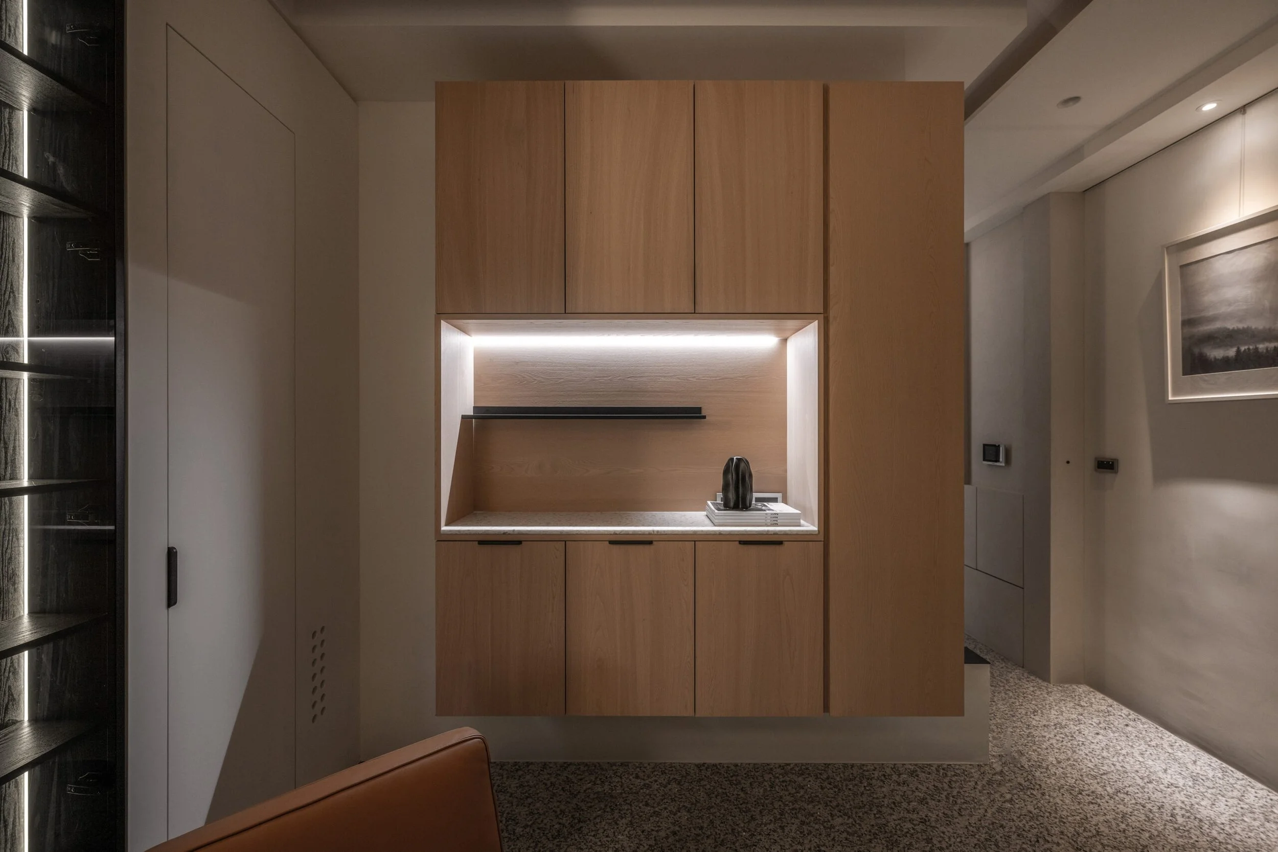
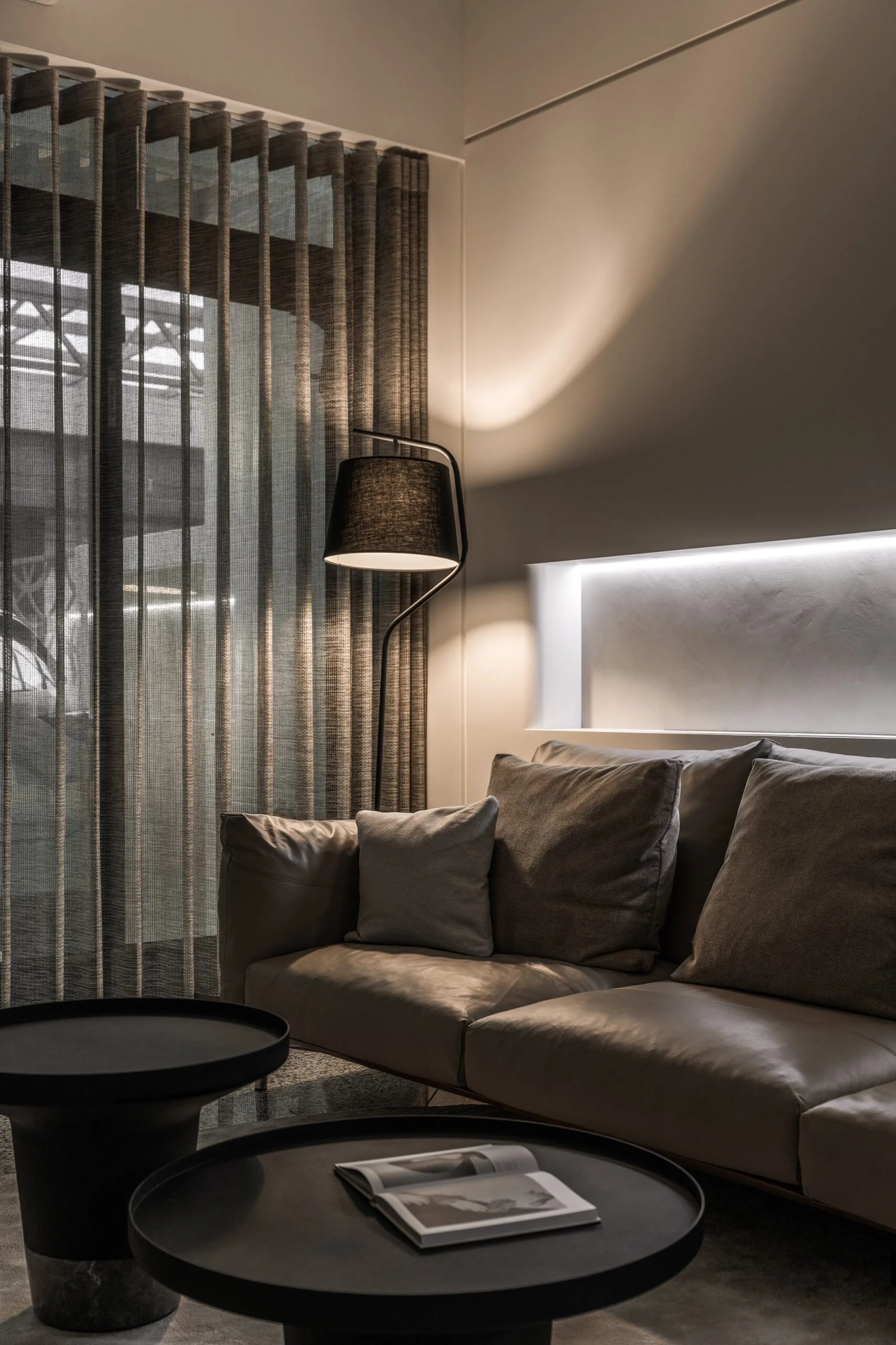
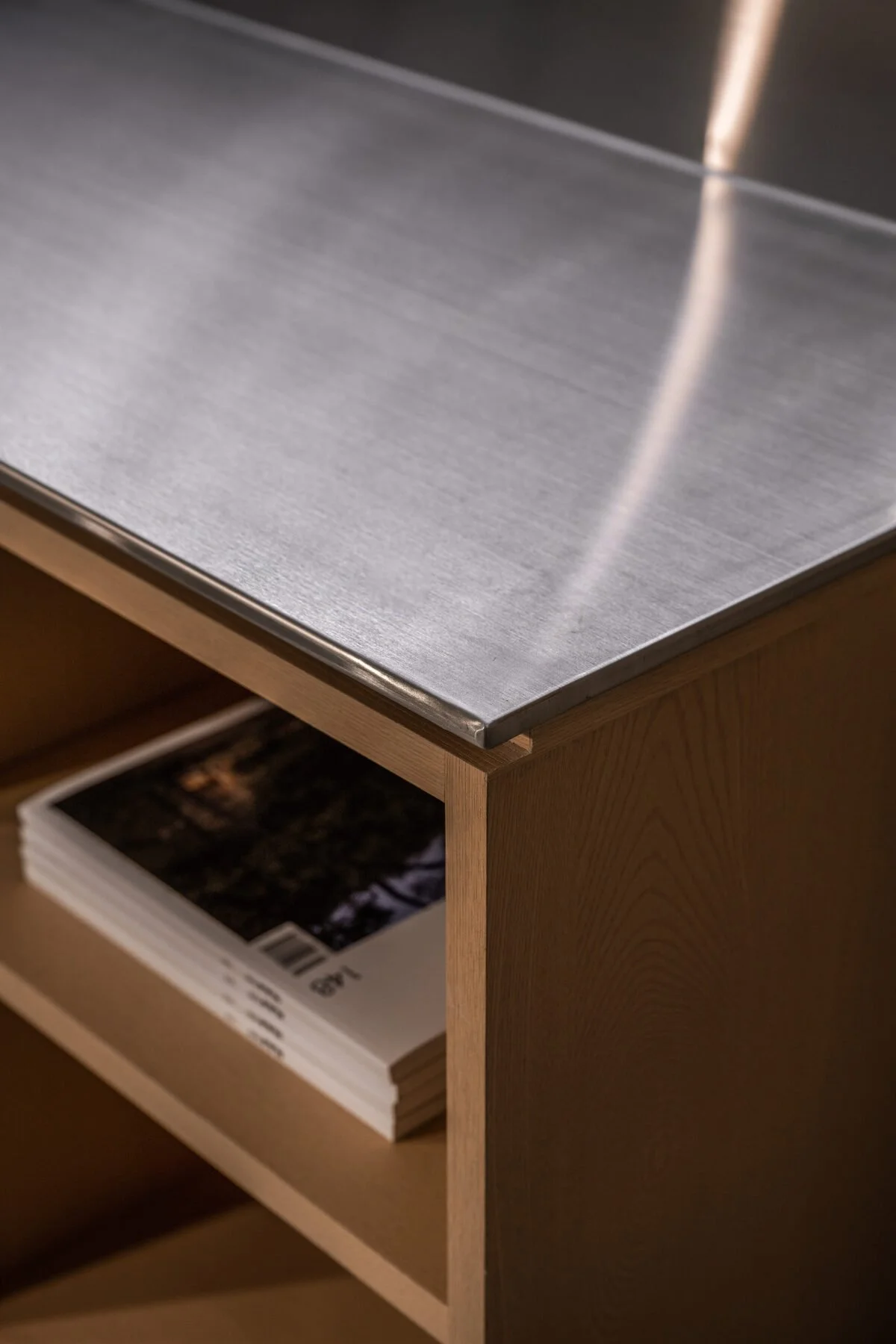
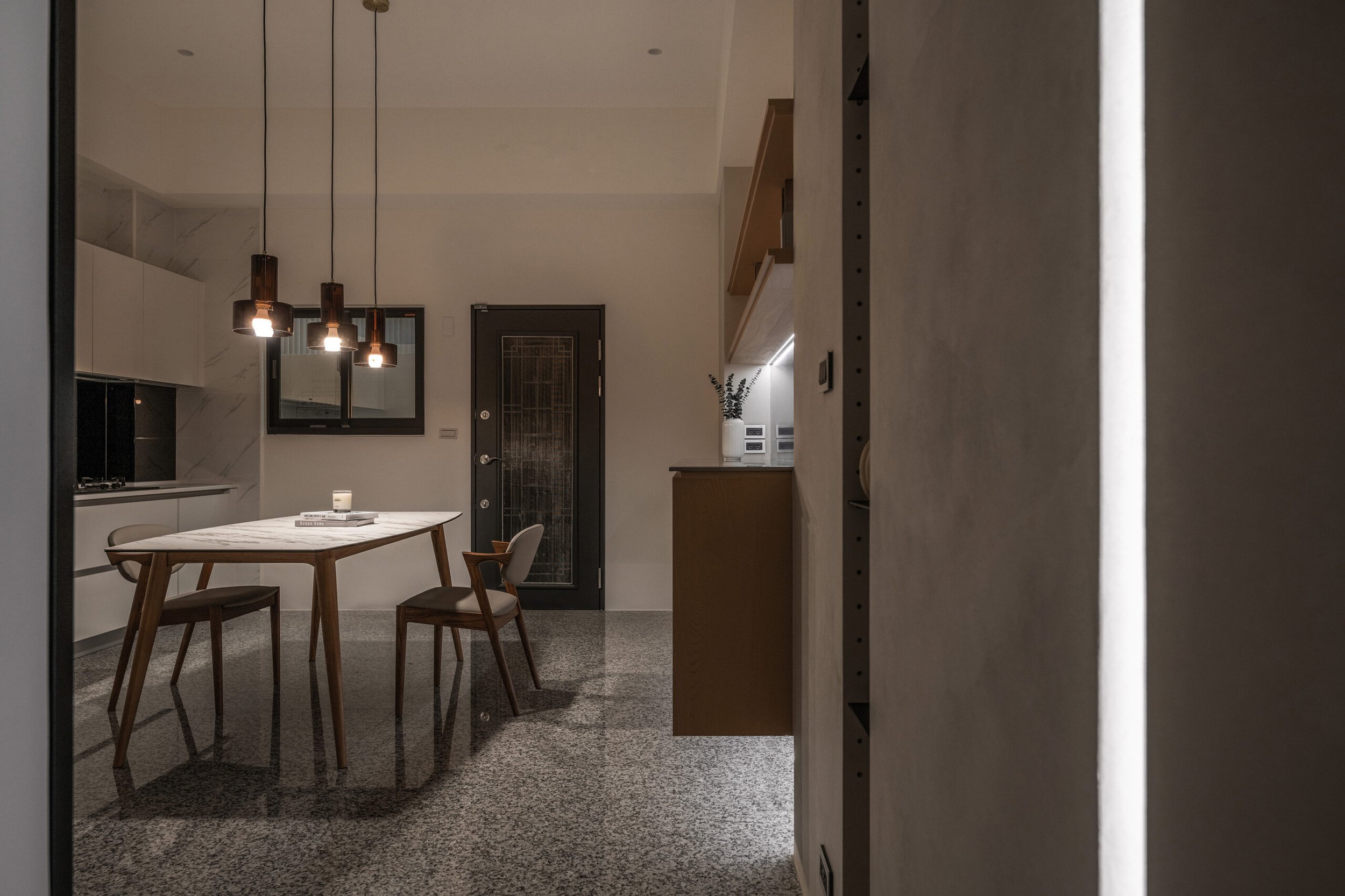
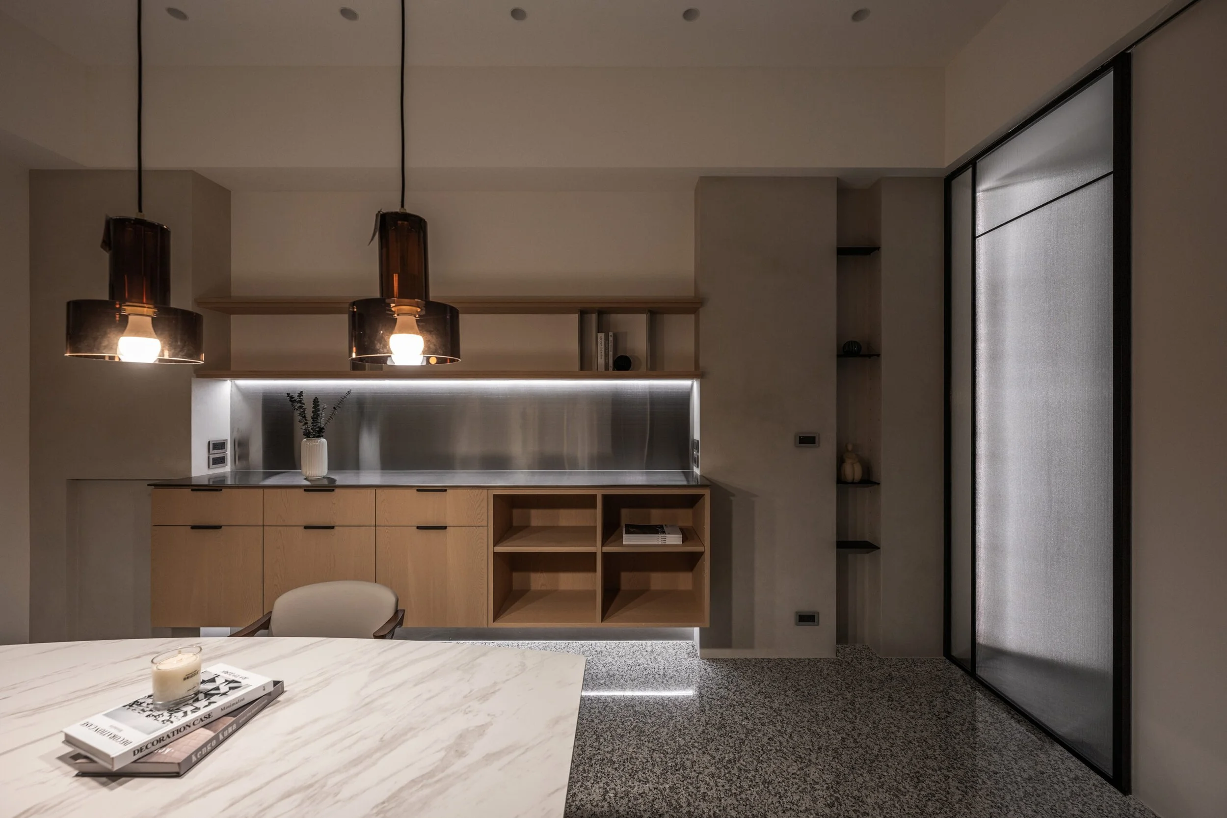
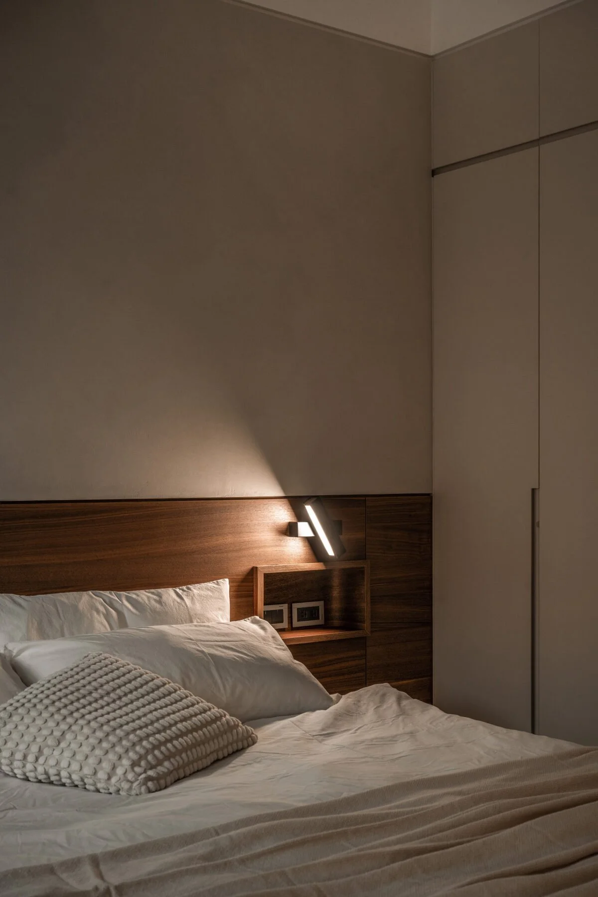
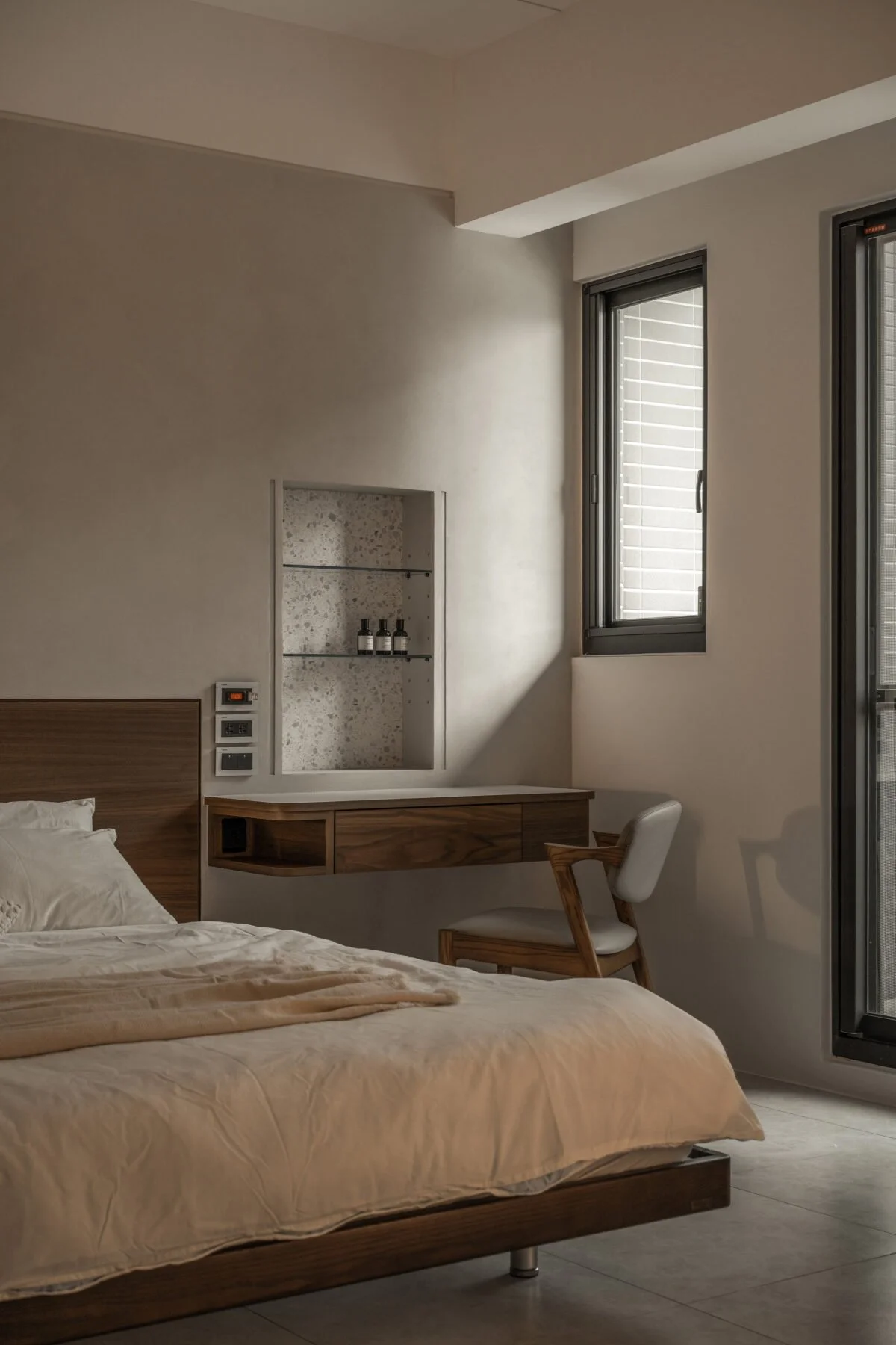
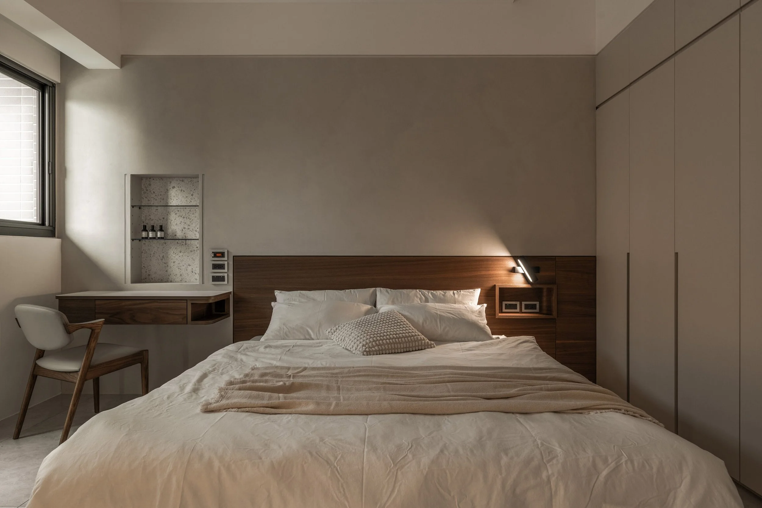
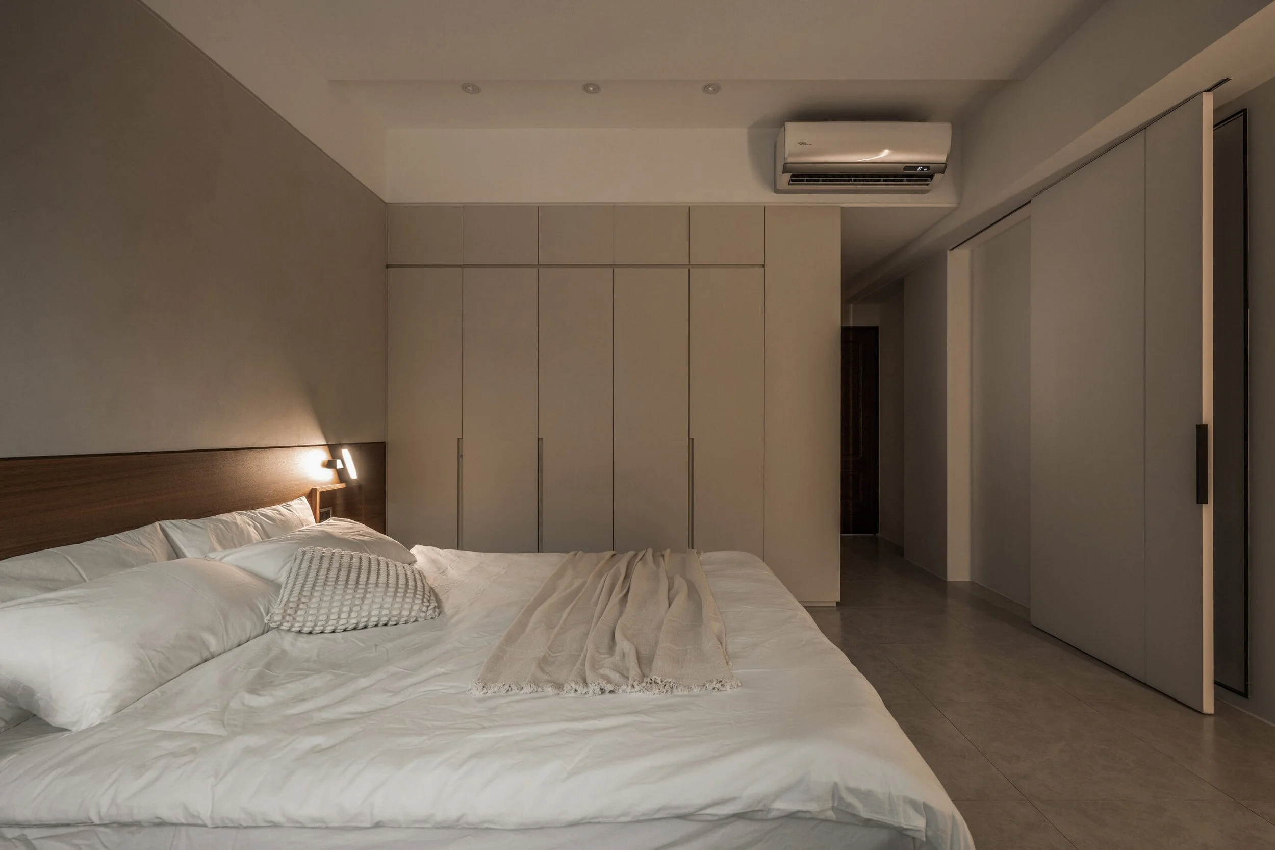
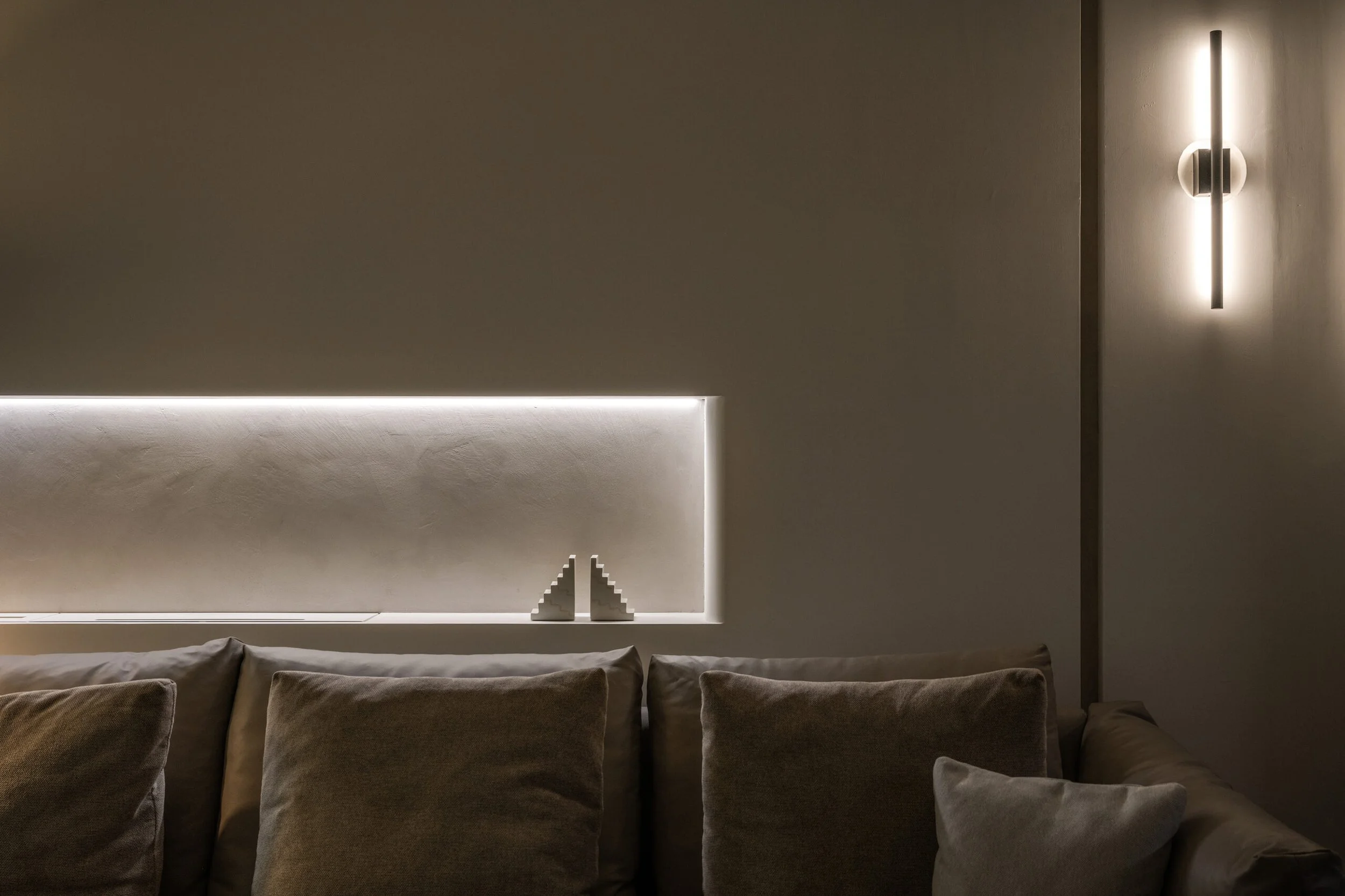
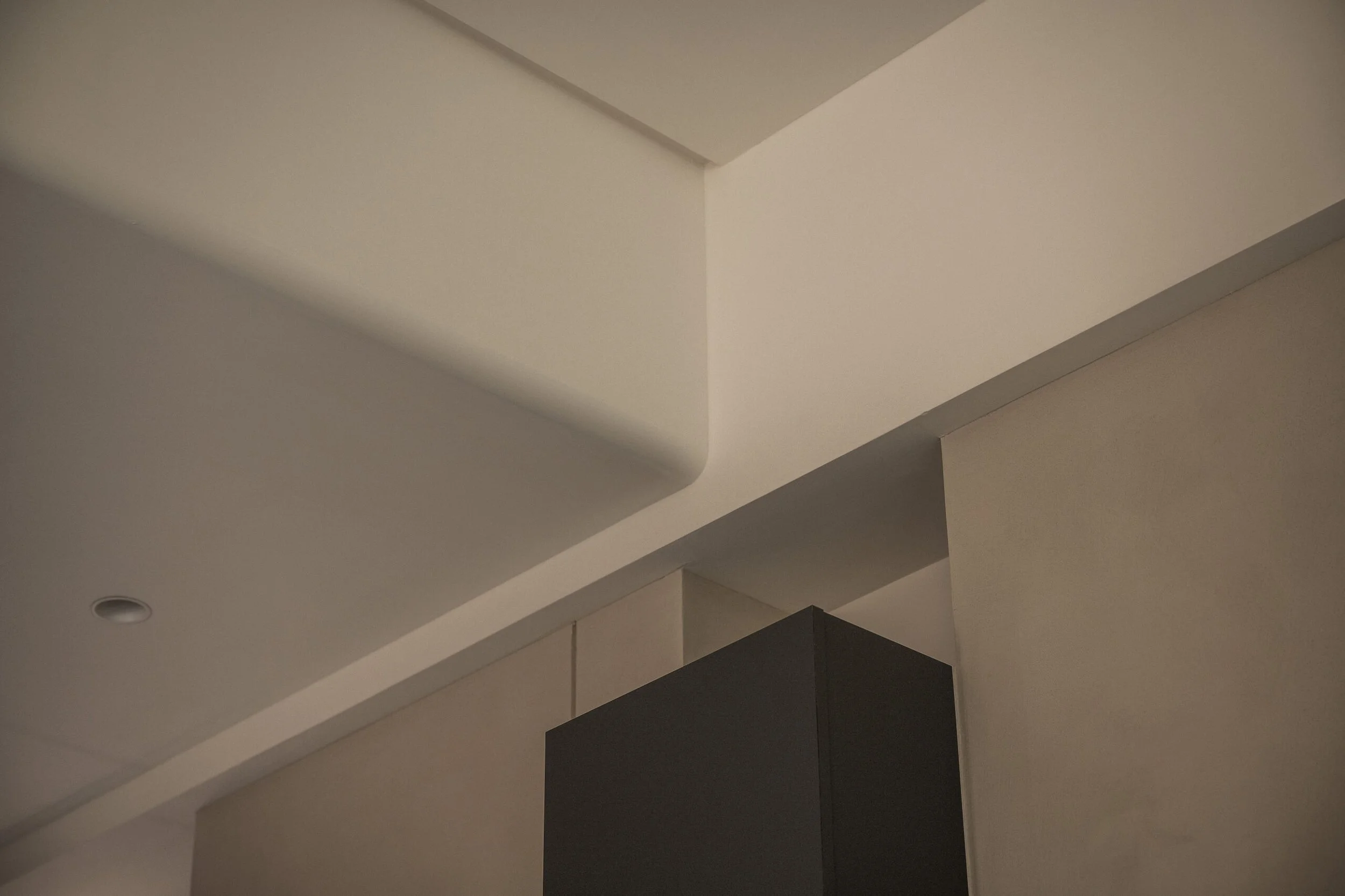
在維持原始地面的條件之下,對於空間的色彩配置與紋理加以揣摩,遂以去繁從簡,選擇帶有溫潤感的材質,與塗料的手刷紋理,平衡地板的冷冽感。重複出現的米灰塗料量體,貫穿客廳至廚房動線,以此為設計符號,比例切割、劃分並容納生活所需機能,弱化了傳統透天因過多樑柱,而產生的畸零處問題。
Under the requirement that the original floor should be maintained, the color scheme and textures of the space are carefully considered. Thus, the coldness of the floor is neutralized by using warm materials combined with the brush stroke texture of the paint. Greige paints appear repeatedly throughout the living area and the kitchen, using this as a design symbol to proportionally cut, divide, and accommodate daily functioning, and to minimize the problem of fragmented space caused by a lot of beams and pillars in the traditional detached house.
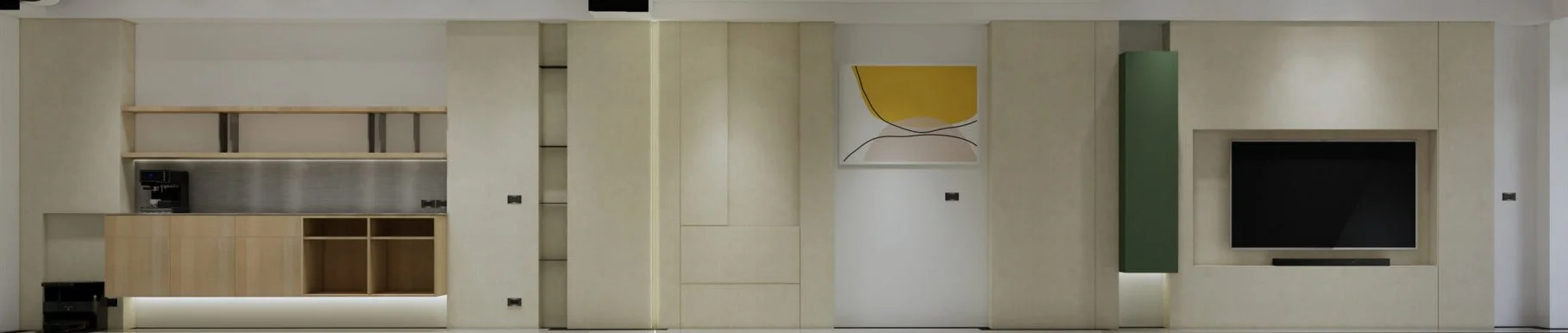
傳統透天常見的連續柱結構,形成多處畸零空間,在不做假牆包覆、壓縮整體空間的前提之下,使用連續性量體,並結合收納與整合功能,使凹凸的牆面收整為本案設計重點。
Prev Project
Next Project
MORI
TRANQUIL